Controversial KL logo costs RM15,000, says City Hall
KUALA LUMPUR, April 29 — The logo and brand master guide promoting Kuala Lumpur as a travel destination cost RM15,000, the city’s Tourism Bureau general manager Noraza Yusof said.
Due to a budget cut in its branding exercise this year, City Hall’s tourism arm has no plans to change the logo for now despite the public ridicule, she said yesterday.
“The budget this year is very tight … usually for this (branding), the cost could range between RM300,000 and RM1 million,” she said.
The logo and tagline, unveiled last Monday, was widely mocked after a magazine highlighted the design online and asked readers for their feedback.
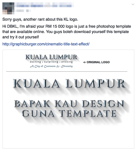
Many questioned the cost, which some claimed to be amateur work that could be done on a computer in minutes.
Noraza said the overall branding exercise was budgeted at RM2.6 million, to be used for roadshows, media junkets and other promotional activities.
Of that sum, RM15,000 was spent on the brand master guide, comprising creation of the logo, tagline, description, rationale and strategy.
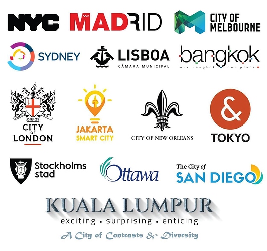
The logo features “Kuala Lumpur” in grey letters with a drop shadow, describing the city as “exciting, surprising and enticing”, and also brands it as a “city of contrasts and diversity”.
Noraza said diverse cultures and the juxtaposition of old and new were among the city’s strengths, and the branding focused on those.
The colour silver for the word Kuala Lumpur was meant to reflect the city’s tin mining roots, she said.
“We need to educate people and make them understand the brand first, the logo was only launched a few days ago,” she said.
She said the bureau welcomed criticism over the design.
“It is a good sign as it showes the KL-ites love their city,” she said.
She said the bureau hoped to increase tourist arrivals into the city to 12 million this year from 11.2 million last year, as well as raise revenue to RM60 billion from RM52 billion last year.
However, mayor Datuk Mhd Amin Nordin Abd Aziz said the logo design was not final.
“From time to time, we will improve on it. We are open to improvement. It can be discussed in the bureau’s quarterly meeting,” he said yesterday.
He said other cities like Amsterdam and New York took years to fine-tune their logos.
He also said the logo was approved by the Federal Territories Minister Datuk Seri Tengku Adnan Tengku Mansor and industry players.
“It is not a one-man show. All key players in the tourism industry are on the bureau’s advisory board,” he said.
The logo and branding initiative was based on findings of the Tourism Master Plan 2015-2025, which is under the responsibility of the bureau.
Amin said signs featuring the logo would be installed in three locations in Kuala Lumpur — at Dataran Merdeka, Bulatan Semantan and Jalan Sungai Besi.
Source: Malay Mail Online


