MasterCard Explains Its New Logo, Both What’s New and What Isn’t
MasterCard has a new look, though it might seem a bit familiar and that’s on purpose.
For the first time in two decades, the company unveiled a new logo and brand identity today. Created by design firm Pentagram, which revamped Verizon’s face last fall, the look will roll out in the fall in conjunction with a new secure digital payment system, Masterpass.
In an interview with Adweek, MasterCard CMO Raja Rajamannar said the impetus for redesigning the logo—and creating an entirely new design system for the company based on circles and arches—came from a desire to modernize the brand and optimize it for the web. The brand also just wanted a simpler design that would be flexible at all touch points.
At the same time, the company was keenly aware of the equity built up in the existing logo and brand identity, and didn’t want to veer from it drastically.
“The MasterCard logo is recognized universally,” Rajamannar said. “There are 2.2 billion cards that carry the MasterCard logo. There are tens of millions of merchants worldwide that carry the MasterCard logo at the point of sale. The key for us is the equity in that logo—we have to leverage that going into the future.”
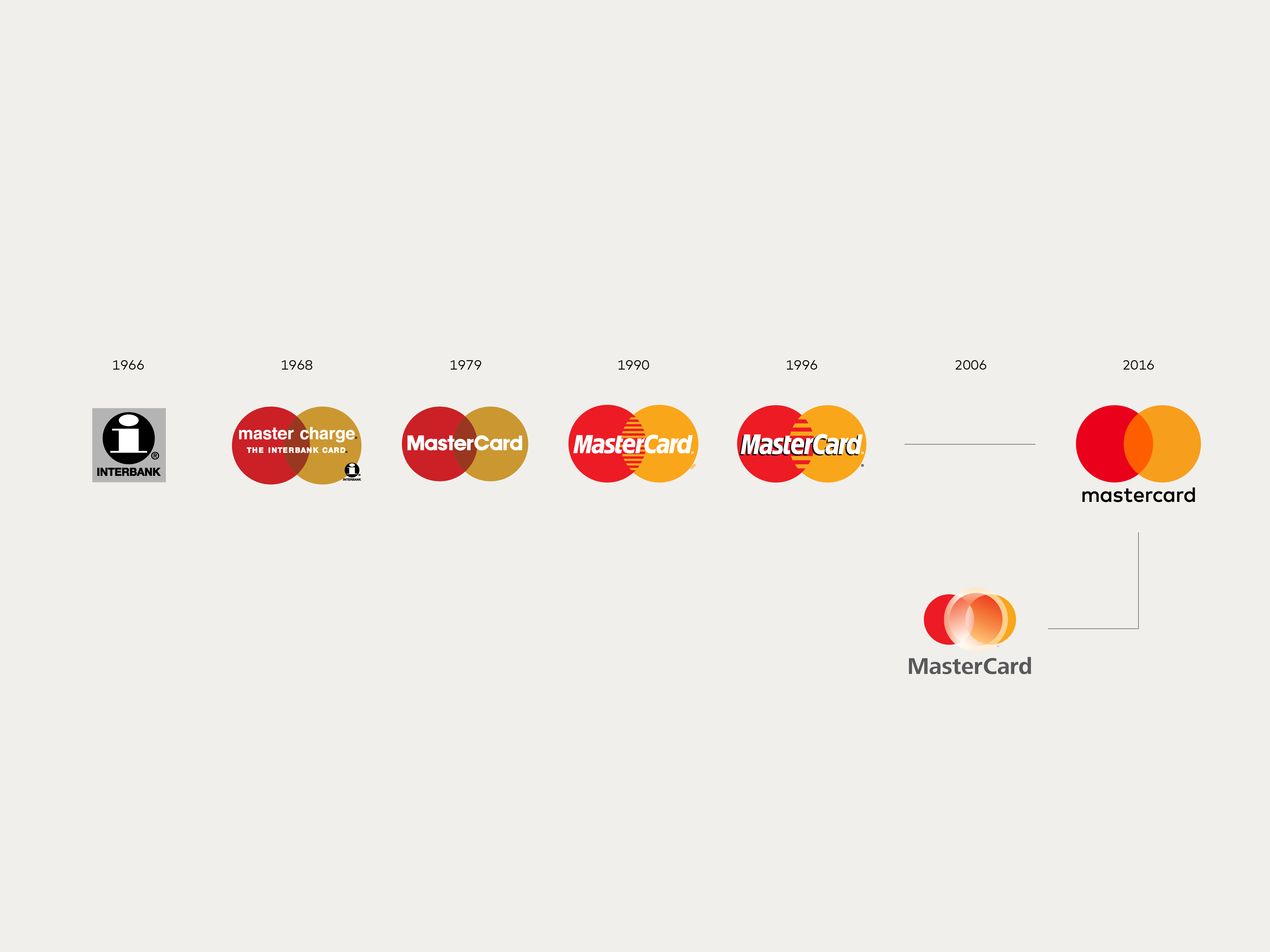
He added: “We had to retain the most recognizable elements of our brand, which are the interlocking circles, the red and yellow colors, and the name MasterCard itself. That’s exactly the path we’ve embarked upon.”
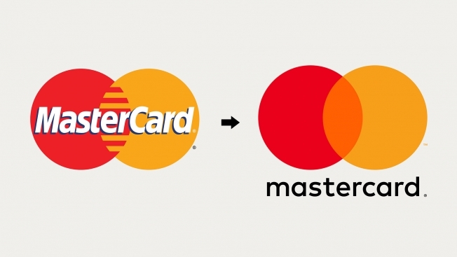
In the old logo, the word MasterCard was placed inside the interlocking circles. In the new logo, the word is outside the circles. This change makes the mark more flexible—it easily can be rendered horizontally or vertically.
Also, the letters M and C were capitalized in the old logo; in the new one, all the letters are lowercase. The result is a visual nod to the evolution of payment.
“We wanted to signify that the card is just one type of payment,” Rajamannar said. “With the evolution that is happening [in digital payment], the card is no longer the most important element. We wanted to de-emphasize it, and so we’ve taken away the capital letter C.”

Circles are the basis for MasterCard’s broader new design system, which is launching alongside the new logo and is the company’s most “comprehensive brand design system” to date. The look will appear on everything from credit cards to billboards, with circles and arches playing a prominent role.
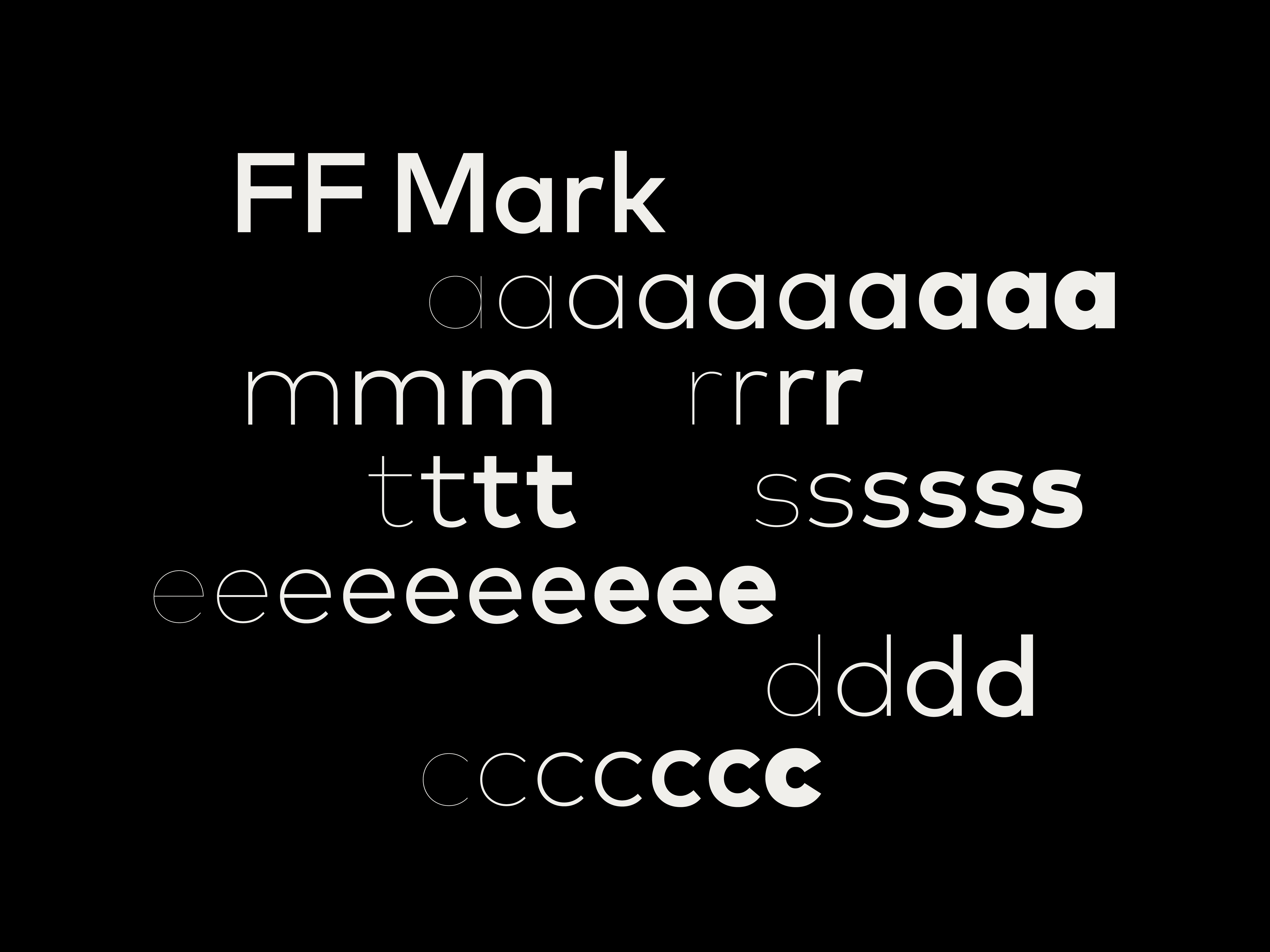
The MasterCard name is rendered in a font called FF Mark, which was chosen for its sleek, modern look and because it reads well at small sizes, Rajamannar said. Its letters are also circular, which fits the broader design system.
Rajamannar did consider one more radical option for the new logo—dropping the word MasterCard entirely and just using the two interlocking circles. That image is so recognizable that the approach might have worked, Rajamannar said—but for now, the company is playing it a little safer and keeping the brand name in the logo.
Source: Adweek